When clients come to me asking for stylish and timeless branding (and they have amazing interior design taste!), I know we’re destined to be a match made in heaven.
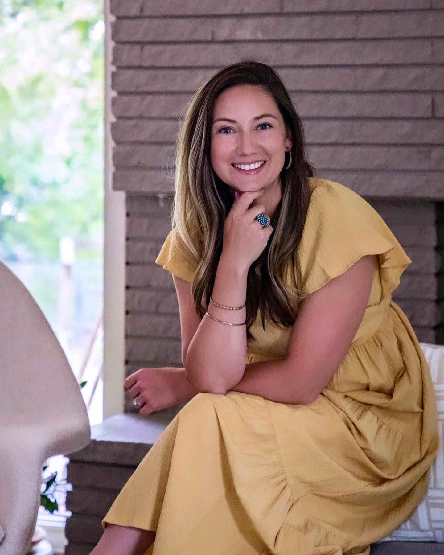
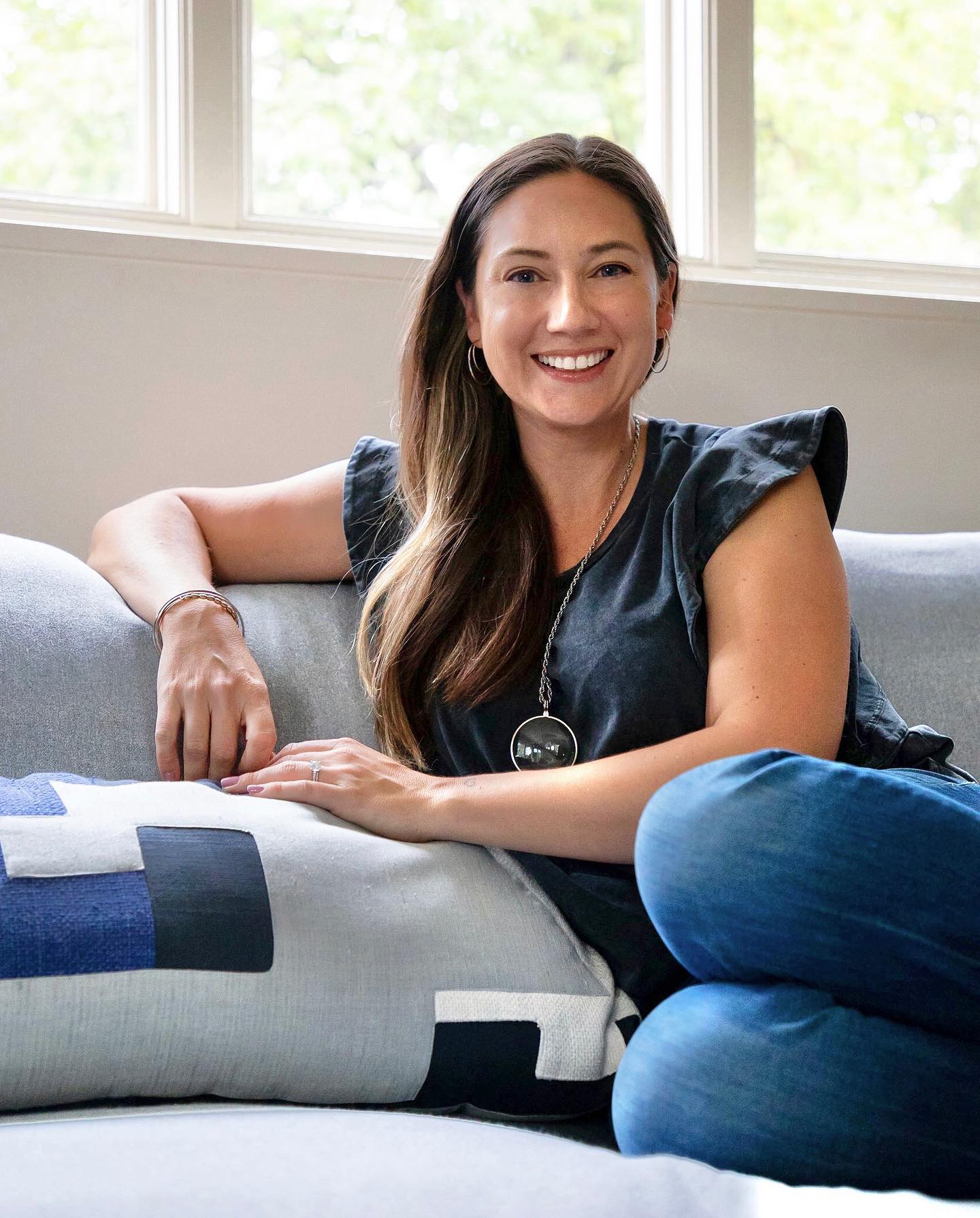
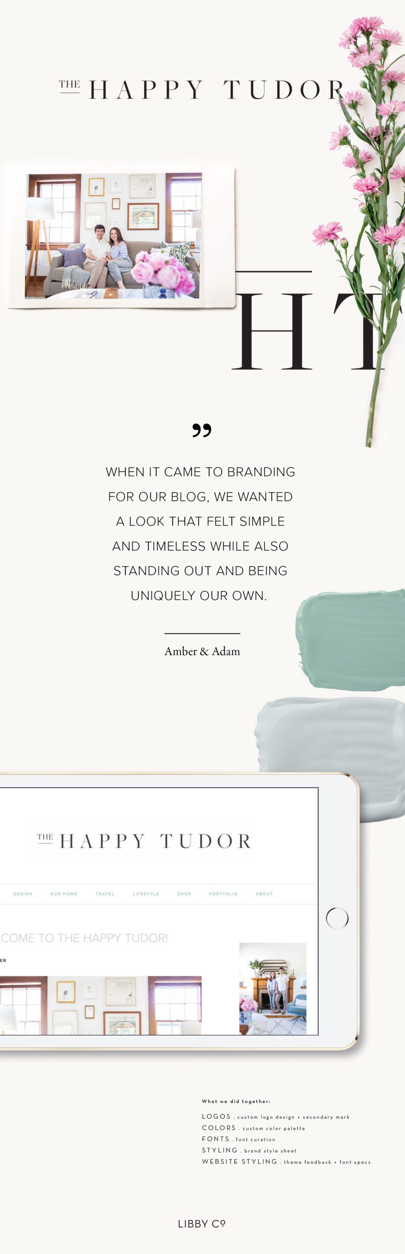
That is exactly what happened when Amber and Adam Ford approached me about doing a logo and brand styling for their newly launched design & lifestyle blog, The Happy Tudor.
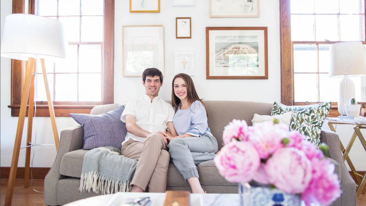
MEET AMBER + ADAM
Amber and Adam are a husband and wife team living in Knoxville, Tennessee. Adam is a photographer and Amber loves all things food and cooking so you can only imagine how lovely their content is.
Their site (and branding) are inspired by their home, a 1940 Tudor that they have been carefully renovating since May of 2016. Spend time exploring and you’ll surely fall in love with their casual timeless style. I know I did.
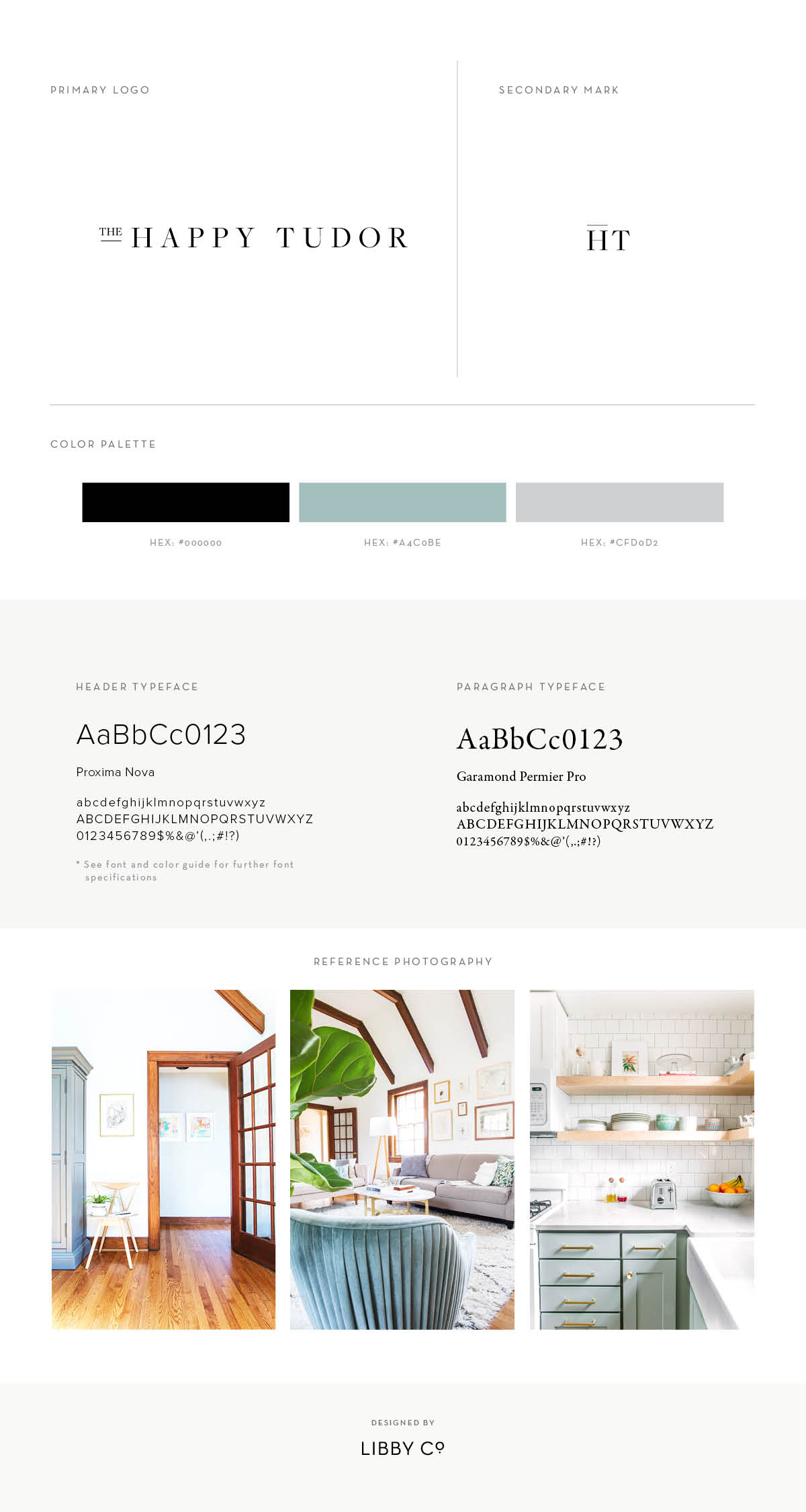
WHAT WE DID TOGETHER
- LOGOS . custom logo design and secondary mark
- COLORS . custom color palette
- FONTS . font curation and specification
- WEBSITE STYLING . theme feedback + branding specifications
Here’s how it all came together on their Branding Style Sheet:
WHAT THEY HAD TO SAY
It was amazing how much Libby understood us and really brought to life what we envisioned. What was most amazing is how she gave us options that we wouldn’t have put together ourselves, but when we saw them, they made so much sense and fit so well with our content.Because our branding was so clear and well set up, we felt confident and prepared to create a site that best reflected our vision for The Happy Tudor.
FOLLOW THE HAPPY TUDOR!
Hop on over to The Happy Tudor and congratulate Amber and Adam on their beautiful new site.
Can’t wait to see where this journey takes them!
XO.
Libby